In luxury dining, the difference between “memorable” and “mythic” is often a matter of millimeters. As design nerds trade viral screenshots of poorly spaced signage from today’s trending “proper spacing” article, the internet is laughing at how bad kerning can utterly derail a message. In the world of fine dining, that same principle isn’t funny at all—it’s the invisible line between a restaurant that feels vaguely off and one that feels effortlessly, impeccably right.
While people share cringe‑worthy examples of misaligned words and disastrous spacing online, the most serious haute cuisine rooms are doubling down on the opposite: microscopic precision. From menu typography to table-top choreography, top restaurants in Paris, Tokyo, New York, and beyond are treating visual spacing, proportion, and silence the way a three‑star chef treats salt—essential, but never showy. For luxury travelers, understanding this new obsession with design precision offers a discreet advantage: you’ll start to see, and book, the rooms where every detail has been edited to perfection.
Below, five insider cues that reveal when a dining room has truly mastered the art of spacing—both on the page and in the room.
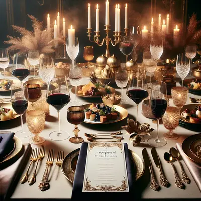
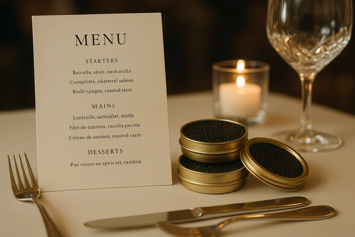
1. The Menu as a Quiet Manifesto, Not a Crowded Brochure
Scroll through today’s viral “bad spacing” screenshots and you’ll see the same sin repeated: too much information, crammed too close, destroying clarity. Luxury dining operators have drawn the opposite conclusion. The most elevated rooms now treat their menus as quiet manifestos—edited, spacious, and typographically exacting.
Notice how many of the most coveted tables—whether at a discreet omakase counter in Tokyo or a grand salon in London—have shifted to fewer words, fewer fonts, and more air. Margins are generous. Dishes are listed with a kind of poetic restraint, ingredients often reduced to a vertical cadence of two or three words rather than a paragraph. Line spacing is wide enough to read comfortably in low light, without feeling padded.
For travelers, the menu’s spacing is a powerful tell. If the restaurant is willing to sacrifice revenue‑generating menu real estate for visual calm, it likely takes similar care with pacing, portioning, and service. Sparse, beautifully set type also hints at confidence: the kitchen doesn’t need to shout. In a world dunking on chaotic kerning, the next truly memorable dinner will probably begin with a piece of card stock that feels less like a menu and more like a limited‑edition print.
2. The New Luxury: Negative Space on the Plate, Not Just on the Wall
Today’s jokes about word spacing translate directly to plating. Just as a line break can change a sentence’s meaning, the distance between a sauce swipe and a main component can alter how your palate experiences a dish. Forward‑thinking chefs are using negative space not as empty decoration but as a structural ingredient.
In dining rooms from Copenhagen to Kyoto, you’ll notice a shared discipline: plates are rarely crowded. Each element has breathing room, often aligned with invisible axes that echo the geometry of the plate itself. Sauces are placed at measured intervals; garnishes are no longer scattered, but positioned with architectural intention. This is not the overwrought smear culture of early tasting menus—it’s calmer, almost meditative.
To the trained traveler, that negative space signals several things. First, portion control anchored in confidence: the kitchen trusts its flavors enough not to over‑serve. Second, a choreography of bites—where to begin, where to finish—subtly guided by placement and distance. And third, sensitivity to photography: dishes that look composed from any angle, without needing filters or frantic cropping. In an era when the world is laughing at design mistakes, true luxury is a plate that could be framed as is, unedited.
3. Table Architecture: Millimeter‑Perfect Place Settings
The online fascination with botched spacing underscores something fine‑dining veterans have always known: alignment is emotion. When you sit down in a truly exceptional restaurant, the table itself functions like a precision‑designed interface. Forks, glassware, and folded linens are not simply present—they are calibrated.
At leading rooms in New York, Hong Kong, and Paris, pre‑service briefing now often includes literal measurement: the distance from plate edge to cutlery, the angle of the knife relative to the table, the offset between water glass and wine stem. It’s an almost horological obsession that most guests never consciously notice. Yet your nervous system does. A perfectly aligned table subtly reassures your brain that someone is in control, that chaos has been edited out.
Luxury travelers can start reading these table landscapes as quickly as a sommelier reads a wine list. Are place settings symmetrical across the room, or does each table feel improvised? Are chairs centered to the table’s geometry, or drifting? Is there just enough space between tables for staff to move silently, but not so much that the room feels empty? When spacing is right, conversation flows more easily, your posture adjusts, and the entire evening feels, inexplicably, more composed. The best rooms use millimeters to tell you: relax, we’ve thought of everything.
4. Sound, Light, and Distance: The Invisible Spacing Between People
While the internet is fixated on letter spacing, hospitality designers are obsessing over something more intimate: human spacing. The most progressive fine‑dining spaces are built not around tables, but around the precise distance between guests—how sound, light, and movement will travel through that gap.
In cities where real estate is punishingly expensive, the new luxury is no longer simply a corner table; it’s acoustic privacy engineered into the architecture. Ceiling treatments, wall panels, upholstery choices, and even the shape of banquettes are tuned to create a gentle, velvety hush. Tables are spaced so your neighbor’s laughter registers as texture, not intrusion. Lighting follows suit. The glow is tight and vertical—pooling onto your table, fading at the edges—so you feel enveloped but not observed.
For frequent travelers, this is where no‑compromise thinking reveals itself. A restaurant that could have squeezed in four extra tables but didn’t has chosen experience over yield. You can tell within thirty seconds of sitting down: Are you leaning in to hear your companion, or raising your voice to compete with the room? Is there a clean visual “frame” around your table, or do you feel cropped into someone else’s evening? When the answer is right, time elongates, and dinner becomes less a meal and more a private interlude suspended above the city.
5. The Digital First Impression: How Online Spacing Predicts Real‑World Precision
The trending gallery of design fails is a reminder that our first encounter with any restaurant is almost always digital—and that spacing disasters online often foreshadow deeper issues offline. Sophisticated operators are acutely aware of this. The most serious fine‑dining rooms now treat their websites, booking platforms, and even confirmation emails with the same granular care as a chef gives a signature dish.
Look closely at a top restaurant’s online presence. The typography is typically spare, with generous white space and uncluttered navigation. Photos are allowed to breathe; there’s no collage of overlapping images, no frantic carousels, no dense paragraphs. Even reservation flows are being re‑designed so that each step feels calm and deliberate, with clear hierarchy, ample margins, and alignment that mirrors the understated geometry of the dining room itself.
For luxury travelers planning a high‑stakes evening in an unfamiliar city, this is a powerful filter. Sloppy kerning on a booking page, chaotic spacing on an online menu, or cramped, over‑busy promotional graphics often signal a lack of holistic thinking. By contrast, a digital footprint that feels serene and meticulously spaced almost always belongs to a team that understands that luxury is an ecosystem, not a single moment. The way they space a headline, align a button, or structure an email is often exactly how they’ll plate your main course and pace your evening.
Conclusion
As social media delights in mocking bad kerning and catastrophic spacing, the best fine‑dining rooms are making the opposite case: that true luxury is built in the spaces between things. In the negative space on a plate, the breathing room on a menu, the quiet gap between tables, and even the margins of a confirmation email, a restaurant quietly reveals its values.
For the discerning traveler, learning to read these micro‑signals is like acquiring a new palate. Once you notice how spacing shapes feeling—how precisely calibrated design softens your shoulders, focuses your attention, and lengthens the evening—you’ll never choose a dining room the same way again. In a world that sees spacing as a punchline, the most unforgettable meals are being crafted by those who treat it as their most discreet luxury.
Key Takeaway
The most important thing to remember from this article is that this information can change how you think about Fine Dining.